Introduction to Exploratory Data Analysis (EDA) with Python
Author Linda Oranya, Turing College learner
Before I started at Turing college, I must say that I approached data exploration differently, which made it difficult for me to gain many insights from my data. I’ll start off by saying that whenever you want to begin exploring your data it’s always best to go in blindly without preconceptions. This will help you to get the best insights from your data.
I will approach this topic by answering the what, why, when, how.
“Exploratory data analysis can never be the whole story, but nothing else can serve as the foundation stone.” — John Tukey
Let’s begin … Try to stay with me
What is Data Exploration? Data Exploration is basically understanding your data so that you can make the best use of it and achieve accurate results or insights. Data Exploration is a necessary must-have skill for every Data Scientist. Without adequately exploring your data, it will be difficult to even understand how to use it to make the best decisions or even gather insights.
Why Data Exploration? I think I have answered this a little in the last paragraph. But to reiterate, it is really important to perform Data Exploration before you dive into modeling your data. The fact is that what you put in is what you get out. You don’t want to model data with a lot of noise because that is definitely what you will get out - a lot of noise!
When do you perform Data Exploration? You perform data exploration before you do anything with your data. This will enable you to find abnormalities in your data, such as null values, inconsistent data, data format, etc. This will even enable you to understand how much you will be able to extract from the data, before you actually perform any actions on that data.
Now to the how I hope that by now you are really convinced of the importance of data exploration. Let’s now get a little technical. For this article,I will be using python programming. Python has lots of libraries that can be used for exploration. I will try to use as little as possible and hopefully, soon, I might write about these libraries.
To start with, I will be using this data from kaggle. I found it really challenging to explore this data since it was majorly numerical values, but as you must know, that’s the work of a data scientist, so why not!
Once you have downloaded the data into your local computer or drive (depending on what works best for you), you can go ahead and import the necessary libraries.
import pandas as pd
import numpy as np
import matplotlib.pyplot as plt
import seaborn as sns
import plotly.express as px
Once that is done, read in your data using pandas. Note that your file path and filename may differ.
data = pd.read_csv('../data.csv')
Woah! Woah! Now take a deep breath and start exploring your data as much as you can. One thing that helped me a lot was to approach the exploration like you don’t know anything about the data. Of course, you should know something, but the trick is not to make any assumptions at all. You should try to answer any questions that the data presents.). I like to use the hypothesis approach, where I raise a hypothesis and try to prove it right or wrong. Now that you understand this, let’s go!
I will start by checking my columns and the null values in the dataset ( if any exist).
#check data columns
data.columns
#check basic info about the data (data types and no. of rows)
data.info()

Output 1 for the data columns

Output 2 for data info
We can see that there are 1000 rows in the dataset and no null values. Also, we have 28 columns that are float datatype and 2 objects. There is no need to change this as it is correct. In some cases, you might want to change the datatype to a more suitable one or even fill in the null values.
Now, to understand how the features affect the music genre, we will assume a hypothesis and try to validate it with our dataset.
Hypothesis 1: Loud music has a high tempo
plt.figure(figsize=(30,10))
genres = data['label'].unique()
tempos = [ data[data['label']==x].tempo.mean() for x in genres ]sns.barplot(x=genres, y=tempos, palette="deep")
plt.title("Average tempo by genre", fontsize = 18)
plt.xlabel('Genre', fontsize = 18)
plt.ylabel('Mean Tempo', fontsize = 18)

A plot of average tempo by genre
The above plot confirms my assumption, since the music genre with the highest average tempo is the loudest (Classical, Metal, Reggae)
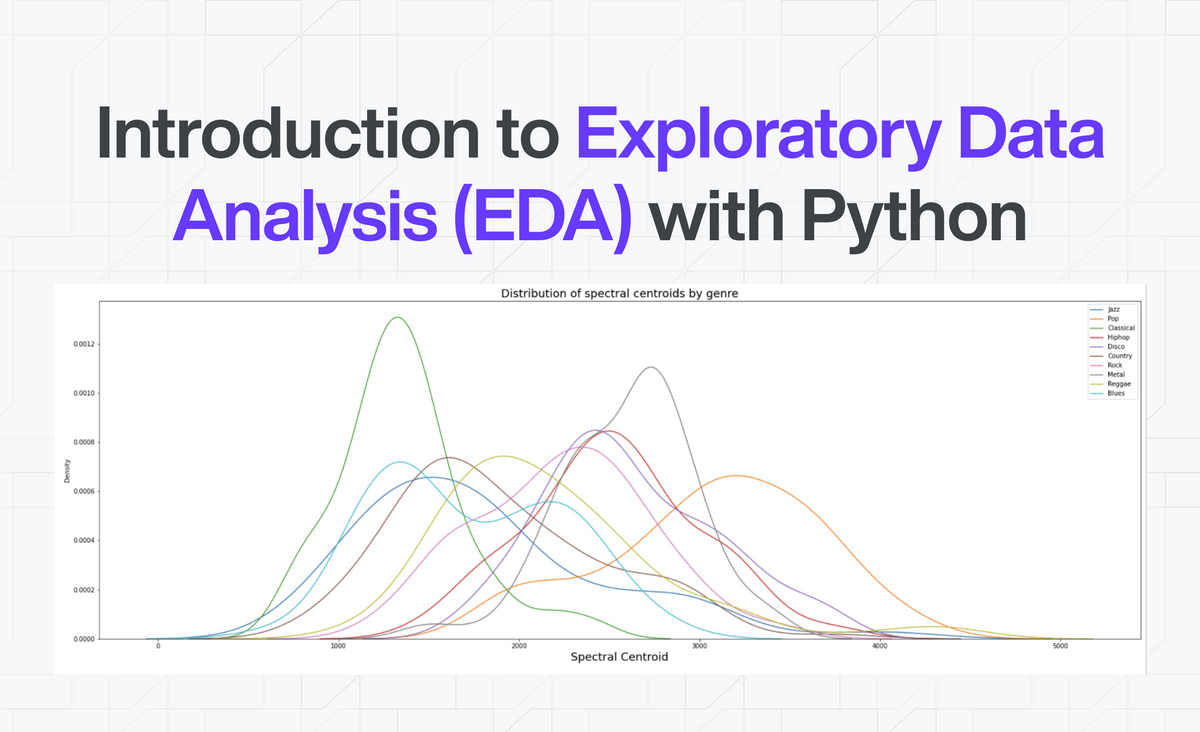
Hypothesis 2: Music with a higher spectral centroid tends to have brighter sounds.
plt.figure(figsize=(30,10))
sns.kdeplot(data=data.loc[data[‘label’]==’jazz’, ‘spectral_centroid’], label=”Jazz”)
sns.kdeplot(data=data.loc[data[‘label’]==’pop’, ‘spectral_centroid’], label=”Pop”)
sns.kdeplot(data=data.loc[data[‘label’]==’classical’, ‘spectral_centroid’], label=”Classical”)
sns.kdeplot(data=data.loc[data[‘label’]==’hiphop’, ‘spectral_centroid’], label=”Hiphop”)
sns.kdeplot(data=data.loc[data[‘label’]==’disco’, ‘spectral_centroid’], label=”Disco”)
sns.kdeplot(data=data.loc[data[‘label’]==’country’, ‘spectral_centroid’], label=”Country”)
sns.kdeplot(data=data.loc[data[‘label’]==’rock’, ‘spectral_centroid’], label=”Rock”)
sns.kdeplot(data=data.loc[data[‘label’]==’metal’, ‘spectral_centroid’], label=”Metal”)
sns.kdeplot(data=data.loc[data[‘label’]==’reggae’, ‘spectral_centroid’], label=”Reggae”)
sns.kdeplot(data=data.loc[data[‘label’]==’blues’, ‘spectral_centroid’], label=”Blues”)
plt.title(“Distribution of spectral centroids by genre”, fontsize = 18)
plt.xlabel(“Spectral Centroid”, fontsize = 18)
plt.legend()

Output
Classical music has the most spectral centroid, indicating that it has the brightest sounds.
Hypothesis 3: The Disco music genre has higher beats per minute than other music.
plt.figure(figsize=(30,10))
sns.kdeplot(data=data.loc[data[‘label’]==’jazz’, ‘beats’], label=”Jazz”)
sns.kdeplot(data=data.loc[data[‘label’]==’pop’, ‘beats’], label=”Pop”)
sns.kdeplot(data=data.loc[data[‘label’]==’classical’, ‘beats’], label=”Classical”)
sns.kdeplot(data=data.loc[data[‘label’]==’hiphop’, ‘beats’], label=”Hiphop”)
sns.kdeplot(data=data.loc[data[‘label’]==’disco’, ‘beats’], label=”Disco”)
sns.kdeplot(data=data.loc[data[‘label’]==’country’, ‘beats’], label=”Country”)
sns.kdeplot(data=data.loc[data[‘label’]==’rock’, ‘beats’], label=”Rock”)
sns.kdeplot(data=data.loc[data[‘label’]==’metal’, ‘beats’], label=”Metal”)
sns.kdeplot(data=data.loc[data[‘label’]==’reggae’, ‘beats’], label=”Reggae”)
sns.kdeplot(data=data.loc[data[‘label’]==’blues’, ‘beats’], label=”Blues”)
plt.title(“Distribution of beats by genre”, fontsize = 18)
plt.xlabel(“Beats”, fontsize = 18)
plt.legend()

Output
This proves my hypothesis right as disco music has the highest beats per minute.
We can definitely go on and on to every single column but I'll leave that to you. The next thing we can do is to check if a strong correlation exists among features. You would not want to keep columns that are alike or similar. A simple data.corr can do this, but because of how many columns there are, we will check for features that are negatively correlated and positively correlated.
data_corr = data.corr()
data_unstack = data_corr.unstack()
sort_data = data_unstack.sort_values(kind=”quicksort”)
print(sort_data[:10])

Output
We can see that mfcc2 (the second coefficient of the Mel-frequency cepstrum, a mathematical representation of the sound) has a strong negative correlation with centroid, rolloff, and bandwidth.
You can do the same with the positively correlated features as well.
I am sure that by now you get the drift, there is no limit to how many insights you can get from your data. So go ahead, be creative and get as many insights as you can get.
I'll see you in my next article!